Series
This is part of a series on using SVG in Power BI. The series supports my session at Power BI Days in Mechelen, Belgium in April 2019.
- Introduction to SVG Basics
- KPI Shapes in Power BI
- Filling up with colour using SVG in Power BI
- Using Text in SVG
- Using SVG Rotate to create a dial in Power BI
- SVG Icons in Conditional Formatting
- Using a Theme to add SVG Icons
- Feb 2023 Update - 5 SVG Stars
In this post I will introduce the possibilities that SVG rotate gives. This post will walk through creating a dial. This post will be done in 2 stages, first a simple dial and then add colours.
Simple Dial
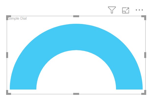
We will start with a simple dial, made up of an arch with a line to indicate a percentage.
The arch is made using a path which combines 2 arcs to make an arch. The arch is then nested in a group element that applies a fill.
| |
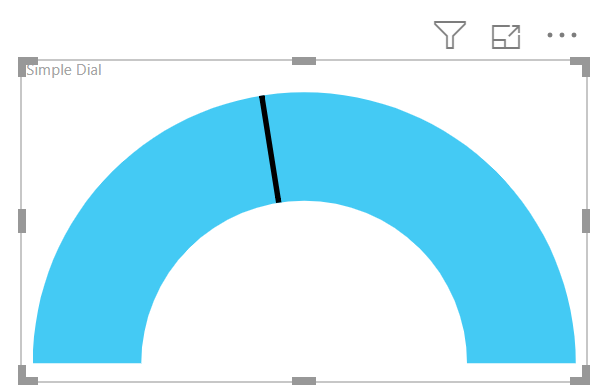
We now need to add a line that will move based on a measure called Score using SVG rotate. So I start by calculating the rotation angle and drawing a line that matches the bottom left of the arch and then rotate it centered on the center point of the arch.
The rotation will be 0 to 180 degrees and the measure Score is a percentage so the calculation is [Score] * 180.
The line is drawn from 0,50 to 20,50 and then a transform is applied of a rotate which has 3 parameters, angle to rotate, x and y for the centre of the rotation. So the bottom part of my measure becomes
| |
Show the Value
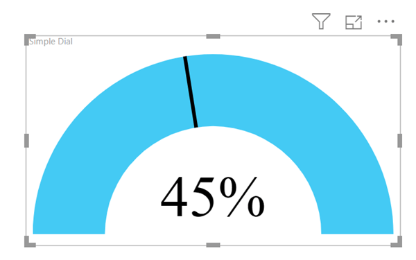
To make it very obvious what value is shown I’m going to add the value of the Score measure. The centre of the arch is 50,50 so I’ll put the middle of the text at 50,40. I used the FORMAT function to apply a percentage, “0%”, format to the score. (See the previous post in this series to look at SVG text)
The bottom part of the measure now becomes
| |
Adding Colours
For this I researched being able to draw parts of an arch. In order to do that I would need to calculate the end points of each arch, which was possible but involved way more mathematics than I was willing to re-learn. My days of using Cos, Sin and Tan have long gone.
So I the trick I used was to draw the arch upside down out of sight and rotate the arch around into view. Different coloured arches can be rotated into view to show different colours.
To draw the arch up the other way I just changed 2 values in svg_arch variable. When drawing an arc in SVG the 5th number after the A specifies which way round the to reach the final point. So the svg_arch variable becomes.
| |
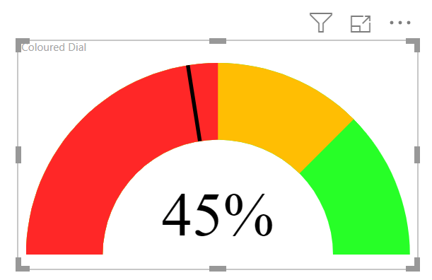
Then we add a coloured arch rotated for each part of the gauge. In my example I am going to show Green upto 100%, Amber starts at 75% and Red at 50%. So the complete measure code now is
| |
Conclusion to SVG Rotate
This post ended up being longer than I expected so my series will expand to make use of a table to store the colour values in another post and drawing a clock into another post.