Series
This is part of a series on using SVG in Power BI. The series supports my session at Power BI Days in Mechelen, Belgium in April 2019.
- Introduction to SVG Basics
- KPI Shapes in Power BI
- Filling up with colour using SVG in Power BI
- Using Text in SVG
- Using SVG Rotate to create a dial in Power BI
- SVG Icons in Conditional Formatting
- Using a Theme to add SVG Icons
- Feb 2023 Update - 5 SVG Stars
This is the fourth post in my series on using SVG in Power BI introducing adding SVG text and actually solves one of the niggles I had with doing KPI figures in Power BI. I didn’t get to do this part as part of my session which started this series. Here is the list of posts.
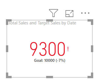
My niggle was the KPI visual. It is a fast way to have a red or green measure displayed. BUT, it requires a trend axis even if you don’t want one and it includes a tiny red exclamation mark or green tick. So I wanted the red / green and the goal shown with no trend or ticks and exclamation marks.
Simple Text Element
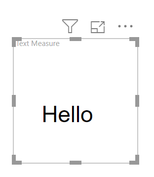
SVG Text elements need an x and y attributes to position the text and a style attribute that uses CSS notation to choose font properties. The example below has the word Hello where the bottom lower left corner is at 20,60.
| |
Aligning SVG Text
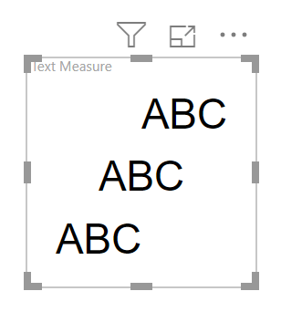
If I am going to replace the KPI visual I need to place a number centred in the SVG graphic. The default alignment is the x and y are the bottom left. This can be changed using the text-anchor attribute for the text element; it can be set to start, middle or end.
Below is an example of the string ABC being aligned start, middle and end.
| |
My KPI Visual
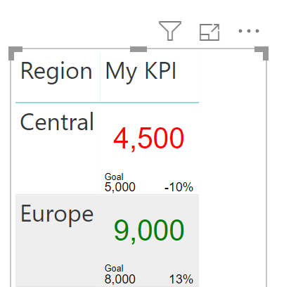
To replace the KPI shown at the start of this post I want a number in the middle of the square showing the measure, bottom left the goal and bottom right how close to the goal we were.
| |
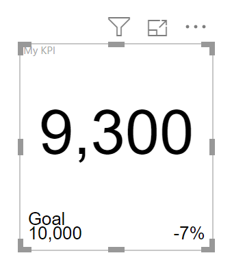
Format function is used to format the number into comma, #,##0 and percent, 0% formats.
The last part is to colour the number based on the Indicator reaching the target. This was covered in Part 2 of this series so I’ll just give the final code.
| |
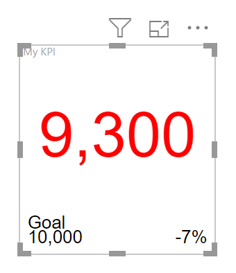
My KPI in a Table
One advantage of the SVG text KPI over the KPI visual is it can be embedded within a table. The total line will work as long as the number measures work.
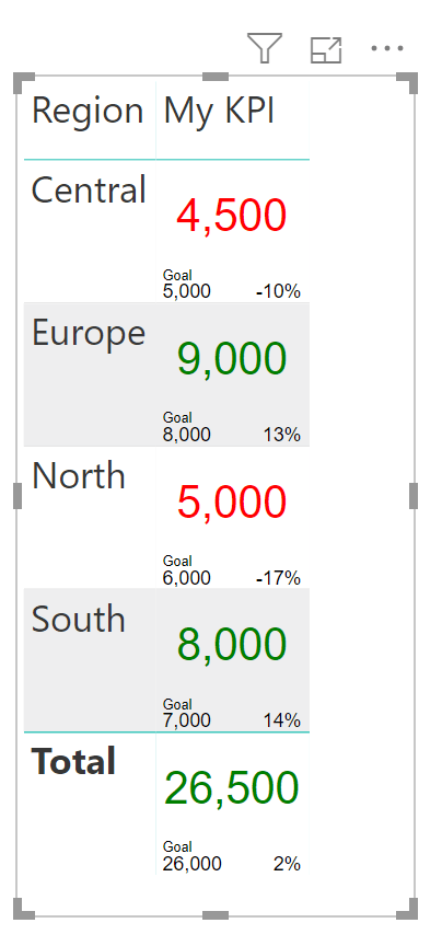
Conclusion
Adding SVG text to a visual does make the visual more informative and the above example makes conditional formatting and data layout possible in a table.