Introduction
Conditional formatting with meaningful icons is one of my favourite ways to make a table or matrix mean something to anyone in the business. Red cross or diamond usually means something is wrong, green tick or circle means everything is okay.1 People understand that as a concept. So to make this easy I use measures and add my own custom icons
Out of Box Conditional Formatting
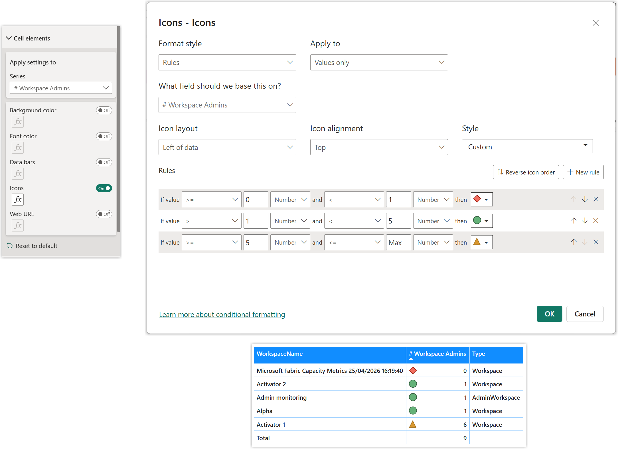
Power BI has a great way to write rules to add conditional formatting to a column in a table. Sadly I hate the form, way too many clicks, way too fiddly for me. In the example shown I’m adding icons to the column showing the number of admins a workspace has. The rules match the logic of 0 admins is bad, 1-4 is good more than 4 has a warning.[^admin]
Use a Measure
When I’m doing conditional formatting on background colours I use a measure. So can I use a measure for icons? I assumed not then I came across a brilliant post on the Radacad blog site written by Reza Rad.
https://radacad.com/power-bi-icon-names-for-conditional-formatting-using-dax/
This gives all the names of the icons that come with Power BI. So my red diamond is called SignLow etc. So next I write a measure.
| |
TipMake sure the measure has a data type of text and format text or this won’t work! Hint - Look on the measures ribbon.
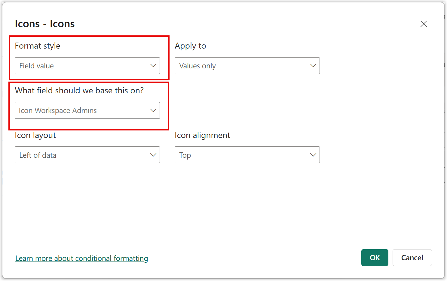
I can then return to the conditional formatting and change format style to field value and select my measure for the field to base this on.
Custom SVG Icon
So the next challenge is the list of available icons is pretty limited. With my SVG skills I want to add my own. Now I’ve covered before creating a column of your own with measures containing SVG. These have the disadvantage of more measures and the dax appears as a tool tip.
Then I remembered I wrote a blog post back in 2019 on adding SVG icons to a theme file, lets use that. I went to try that code out as Power BI has changed a bit since then. And sure enough it didn’t work.
Then I found a video that gave me the solution. I updated my older blog post. The important part is to replace the hash (#) before any colour hex codes with %23.
YouTube Video https://www.youtube.com/watch?v=lfqPpUdtTss
My Old Blog Post - https://hatfullofdata.blog/svg-in-power-bi-7-using-theme-file-svg-icons/
I had three icons I liked

From these I made a theme file. Note that the SVG needs to be a single line for each icon and the colour hex codes start with %23. Remember to replace " with ’ inside your SVG. And this can be added to an existing theme file. Load the theme file into you Power BI report.
| |
You can check your icons have loaded correctly by going to write a conditional formatting rule, in that dialog I hate, and checking your new icons appear down the bottom.
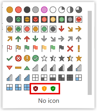
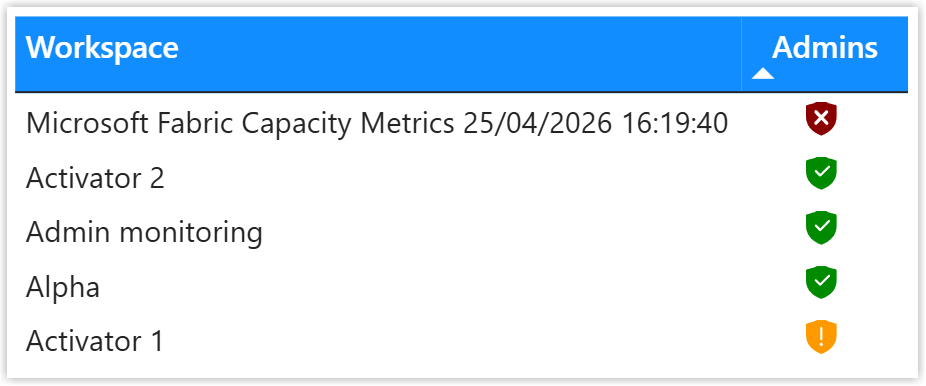
Next I update the icon measure to use the names of the icons in the theme file and hey presto it works! I do a few tidy ups in the table as well.
| |
Conclusion
I’m currently working on building a monitoring report for a Power BI and Fabric audit. I’m hoping to create a table of workspaces with icons that quickly indicate how good or bad a workspace is quickly. So I’m building icons and a theme file to load them all. I know customers who have icons they use internally, so I’m recommending they build a good theme file.
Of course icons need a key. So a table of Column, Icon, Description would be a great addition to a report that uses icons.
[^admin] Lets not argue if 1 admin is okay, thats not the point here.
Yes I’m aware of colour blindness, hence I include a shape and yes I’m aware of cultural meanings of colours vary around the world. ↩︎