1
  2
  3
  4
  5
  6
  7
  8
  9
 10
 11
 12
 13
 14
 15
 16
 17
 18
 19
 20
 21
 22
 23
 24
 25
 26
 27
 28
 29
 30
 31
 32
 33
 34
 35
 36
 37
 38
 39
 40
 41
 42
 43
 44
 45
 46
 47
 48
 49
 50
 51
 52
 53
 54
 55
 56
 57
 58
 59
 60
 61
 62
 63
 64
 65
 66
 67
 68
 69
 70
 71
 72
 73
 74
 75
 76
 77
 78
 79
 80
 81
 82
 83
 84
 85
 86
 87
 88
 89
 90
 91
 92
 93
 94
 95
 96
 97
 98
 99
100
101
102
103
104
105
106
107
108
109
110
111
112
113
114
115
116
117
118
119
120
121
122
123
124
125
126
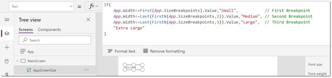
| If(
App.Width
Now the label shows “Extra Large”.
### Adding Title Bar Container
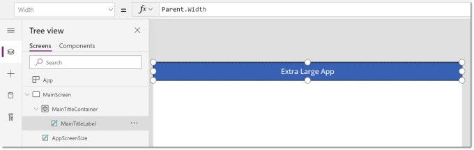
In my example the title bar is the same for every screen size so is the simplest to position and size. It will start in the top left hand corner so x,y will be 0,0. The height is going to be 80 and the width needs to fit the full screen width. The screen is the parent of the container so we can use Parent.Width.
Within the container I’ve placed a text label that will start in 0,0 and the width and height match are Parent.Width and Parent.Height. I also set the text to be AppScreenSize.Text & ” App”. Finally I formatted the text label.
#### MainTitleContainer
X0Y0Height80WidthParent.Width
### First Test
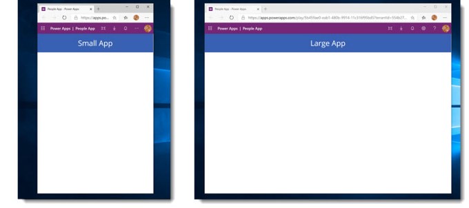
The app is now ready to save and publish. The main test is to check the app resizes correctly and the title bar changes.
## Adding Dynamic Containers
Now we are going to add the containers that will move based on the screen size. In total there are 4 containers to add. The left hand side people selector, the right hand side people information which will contain the final 2 containers that sit side by side in large and extra large and above each other on a medium screen.
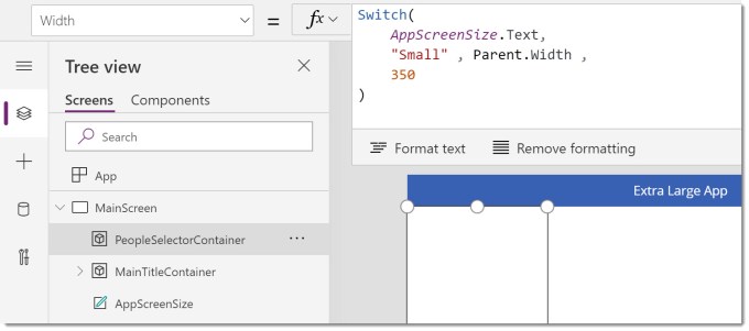
The next container we add is the container down the left hand side. It needs to fit in below the title bar container and fill to the bottom of the screen. For the small screen size the width will be the whole screen width, for all other sizes it will be 350 wide.
#### PeopleSelectorContainer
X0YMainTitleContainer.HeightHeightParent.Height-MainTitleContainer.HeightWidthSwitch(
AppScreenSize.Text,
"Small" , Parent.Width ,
350
)
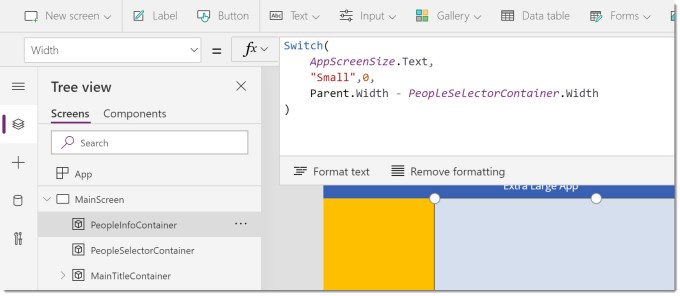
The next container is the People Info container for the right hand side of the screen. This will fill the remaining part of the screen for all sizes except small when it will be 0 width and not seen.
Note I coloured the containers just so we could see the sizes.
#### PeopleInfoContainer
XPeopleSelectorContainer.WidthYMainTitleContainer.HeightHeightParent.Height-MainTitleContainer.HeightWidthSwitch(
AppScreenSize.Text,
"Small" , 0 ,
Parent.Width - PeopleSelectorContainer.Width
)
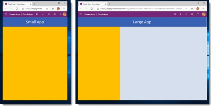
### Second Test
With the two dynamic containers added we can publish and test again to make sure the PeopleSelector resizes to full screen for the small size and the PeopleInfoContainer takes up the right hand side when for any size except small.
### Nested Dynamic Containers
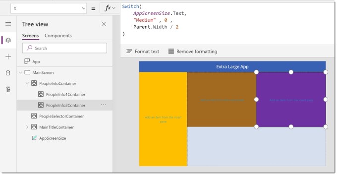
The last two containers will be child containers of the PeopleInfoContainer. For Large and Extra Large screen size they will sit side by side, for Medium screen size they will be one above the other, and for Small it won’t matter because the parent container will be 0 width.
#### PeopleInfo1Container
XPeopleSelectorContainer.WidthYMainTitleContainer.HeightHeight400WidthSwitch(
AppScreenSize.Text,
"Medium" , Parent.Width ,
Parent.Width /2
)
#### PeopleInfo2Container
XSwitch(
AppScreenSize.Text,
"Medium" , Parent.Width ,
Parent.Width /2
)YSwitch(
AppScreenSize.Text,
"Medium" , PeopleInfo1Container.Height ,
0
)HeightSwitch(
AppScreenSize.Text,
"Medium" , Parent.Height - PeopleInfo1Container.Height ,
PeopleInfo1Container.Height
)WidthSwitch(
AppScreenSize.Text,
"Medium" , Parent.Width ,
Parent.Width /2
)
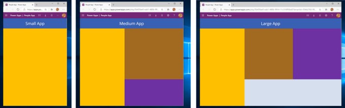
## Final Test
We now have 4 dynamic containers that should all be responsive to the screen size, so we save and publish.
## Conclusion
Responsive design takes time, lots of time. This is why good web coders are paid the rate they are paid, it is a skilled job. Building an app to be fully responsive will take time. I hope this post gives you enough to get going along with the resources from Microsoft.
### Resources
Microsoft have some resources found at
[https://docs.microsoft.com/en-us/powerapps/maker/canvas-apps/create-responsive-layout](https://docs.microsoft.com/en-us/powerapps/maker/canvas-apps/create-responsive-layout)
## More Power Apps Posts
- [Transparency Update](https://hatfullofdata.blog/powerapps-transparency-update/)
- [Using JSON Feature to Save Pictures](https://hatfullofdata.blog/powerapps-using-json-function-to-save-pictures/)
- [AI Builder Object Detect Model](https://hatfullofdata.blog/ai-builder-object-detect-model/)
- [Function Component](https://hatfullofdata.blog/powerapps-function-component/)
- [SVG in Power Apps series](https://hatfullofdata.blog/powerapps-svg-introduction/)
- [12 Days of Components](https://hatfullofdata.blog/power-apps-12-days-of-components/)
- [Build a Responsive App series](https://hatfullofdata.blog/power-apps-build-a-responsive-app-planning/)
- [Embed a Power BI Chart](https://hatfullofdata.blog/power-apps-embed-a-power-bi-chart/)
|