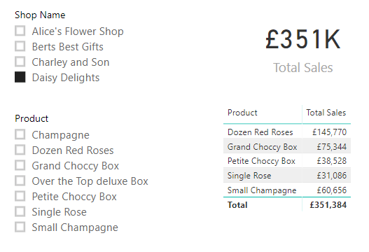
In this post I will look at filtering one slicer based a selection in another slicer. June 2019 Power BI Update included an update to allow a slicer to be filtered based on a measure, which means that you no longer need to use bi-directional relationships.
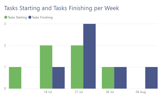
In this post I will show a simple example of how to use a different relationship between two tables in a measure. The example I will use is a list of tasks with start and finish dates. The request is for how many tasks start per week and how many finish per week to be plotted on a column chart.
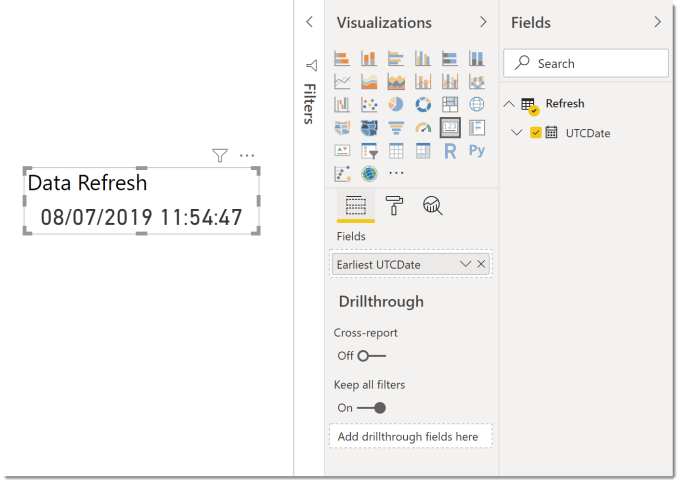
In this quick post I will walk through adding a data refresh date on a report page in Power BI.
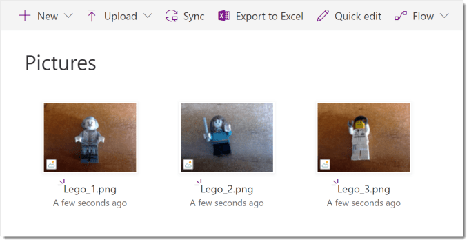
In this post I will be explaining how to use the JSON Function to simplify the saving of multiple pictures from a PowerApp to a SharePoint library using Flow. There have been many wonderful workarounds to do this, finally we now have a slightly less Heath-Robinson method.
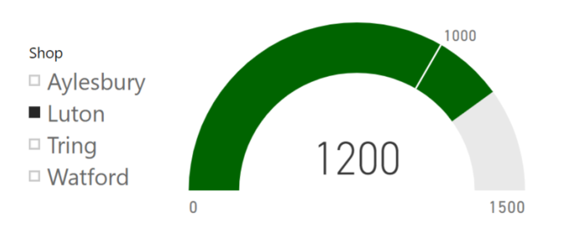
The June 2019 update for Power BI included a few updates for conditional formatting, for visual backgrounds, titles, cards and gauges. This post is my take on the updates and on how I prefer to do the logic behind choosing a colour. Full details of the June 2019 update can be found at https://powerbi.microsoft.com/en-us/blog/power-bi-desktop-june-2019-feature-summary/ Applying Conditional Colour Formatting This update...
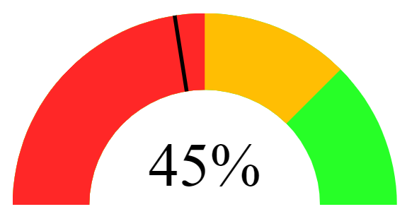
In this post I will introduce the possibilities that SVG rotate gives. This post will walk through creating a dial.
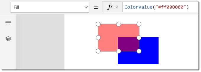
Post describing the update to ColorValue to include transparency and the addition of transparent colour.
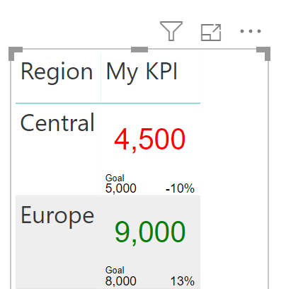
This is the fourth post in my series on using SVG in Power BI introducing SVG text and actually solves one of the niggles I had with doing KPI figures in Power BI. I didn’t get to do this part as part of my session which started this series. Here is the list of posts.
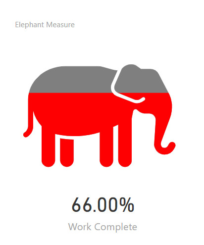
In this post we will introduce using SVG icons and filling the icon with colour to show a percentage value.
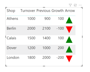
This is the second post in a series of Using SVG within Power BI and introduces shapes to create KPI graphics.